Atoms
Button
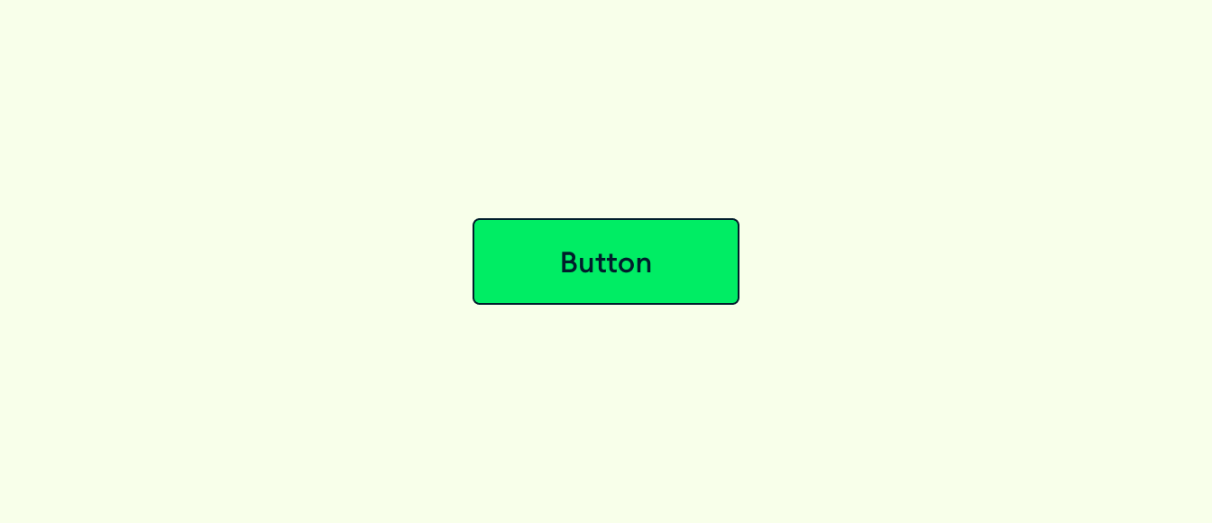
Buttons allow users to perform an action or to navigate to another page. They have multiple styles for various needs, and are ideal for calling attention to where a user needs to do something in order to move forward in a flow.
Anatomy
The button is comprised of a required label, with optional icons on either the left, right or both sides.
Options / Variants / Props?
We can list out all of the different iterations of a button (with / without icons) primary / secondary, tertiary, different states (hover, active, focus, disabled)
Behaviors
Keyboard focus, text overflow/line wrap, min/max sizes
Usage guidelines
When to use the different versions, when to use icons, how not to use colors
Content standards
Writing guidelines for button copy
Theming
When to use default vs inverse buttons
Keyboard interactions
Instructions (if any) for keyboard interactions
Changelog
Do we include a list of updates to the figma/production version or is that unnecessary for users